Mega menu
Mega menus are like supercharged versions of traditional dropdown menus. They provide an expansive, visually captivating browsing experience for your visitors. Unlike regular dropdowns, mega menus don’t just list links. They showcase a wide array of navigation options, including links, images, and even additional content, all neatly organized in a structured layout.

However, if you prefer the default dropdown option, simply choose not to link a menu item.
Mega Menu Types
Promotional | Mega Menu:

With a Promotion Mega Menu, you can highlight your special offers and discounts right in your header, catching your customers' attention the moment they land on your site. It's like having a virtual billboard for your promotions, guiding customers to the hottest deals with just a click. Plus, it adds that extra layer of professionalism to your store, showing customers that you're serious about giving them the best shopping experience possible. So, if you want to drive more sales and keep your customers coming back for more, a Promotion Mega Menu is a must-have for your store!
Layout Settings:

Menu Item:
Specify the name of the menu link that you want to feature as the Promotion Mega Menu in the header. This menu item will act as the entry point for users to access the promotional content. Choose a descriptive and engaging name that clearly communicates the purpose of the promotion, such as "Special Offers" or "Deals of the Day."
Promotion Stack Style:
Determine the layout style for presenting promotions within the mega menu. You can choose between horizontal and vertical stacking of promotion content. Horizontal stacking displays promotions side by side, while vertical stacking arranges them one on top of the other. Select the style that best suits your design preferences and provides an intuitive browsing experience for users.
Image Ratio:
Set the desired image size for the promotion images displayed within the mega menu. This setting allows you to maintain consistency in image dimensions, ensuring a visually appealing presentation. Specify the aspect ratio or dimensions that align with your design requirements and optimize image quality and clarity. Common ratios include Adapt to Image, square (1:1), landscape (4:3), or portrait (3:4), depending on the visual aesthetics of your promotions.
Content Alignment:
- Choose the alignment for the promotional heading and links relative to the promotion images within the mega menu. You can align the promotional heading and links above, below, or beside the promotion images to create a visually balanced layout. Aligning the content under the promotion images ensures clear hierarchy and readability, guiding users to explore the promotions effortlessly. Customize the alignment based on your design preferences and the overall aesthetics of your header mega menu.
Collections | Mega Menu

A Collection Mega Menu in your header is essential. It offers instant access to product categories, simplifying navigation and showcasing your offerings upfront
Layout Settings:

Menu Item:
- Specify the name of the menu link that you want to feature as the Collections Mega Menu in the header. This menu item will act as the entry point for users to access the Collection Mega Menu.
-
Menu Structure
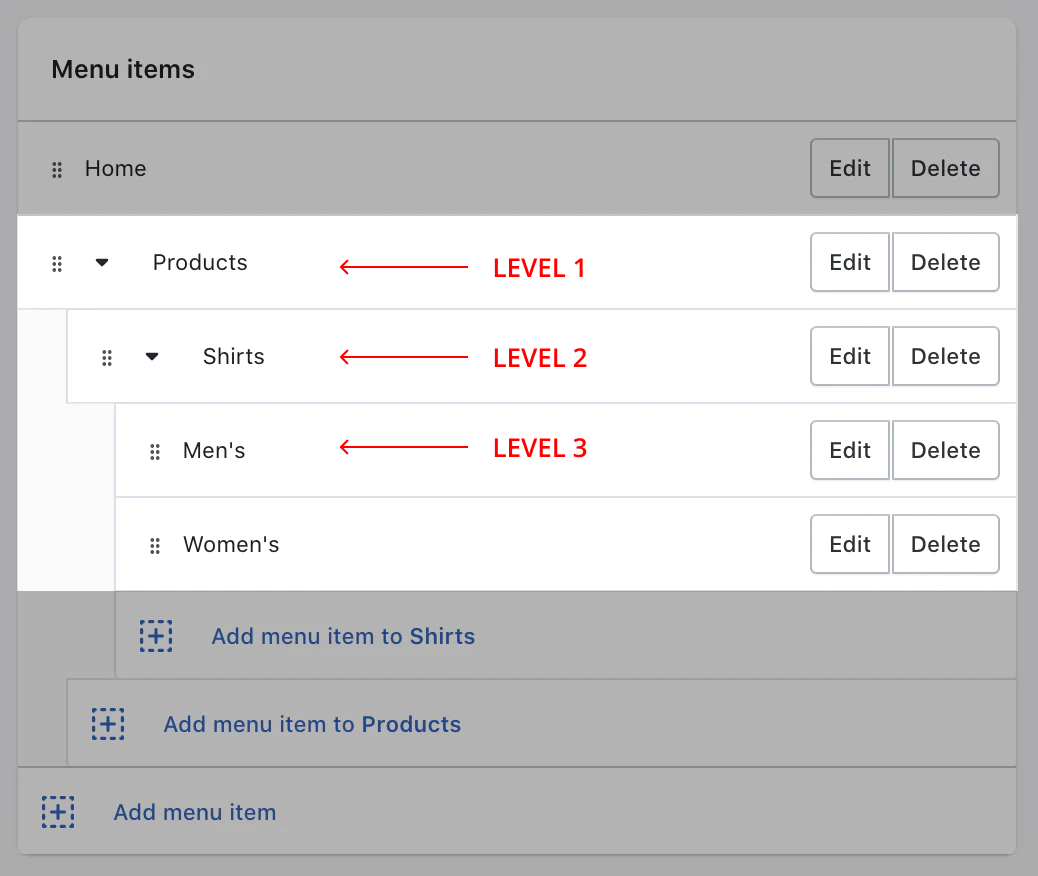
Note:
The mega-menu block is configured to display only links pointing to collections. Below are the default settings:
- The above image refers to the menu item structure in your Shopify navigation dashboard if you want to add Collections | Mega Menu.
- You need to make sure that Level 2 and Level 3 menu items are linked to the right product collections and any other links will not be displayed.
- The images displayed in the slider correspond to the featured images of the collections.
Show Level-3 Links:
This setting allows you to control how navigation links are displayed within the mega menu. Enabling this option changes the display of links in the following ways:
- Level-2 Links as Tabs:
- When you enable this option, Level-2 links (the subcategories under your main menu items) will be displayed as tabs. This means t they will be presented as clickable tabs that users can switch between.
- Level-3 Links as Redirection Links:
- Level-3 links (the sub-subcategories or items under the Level-2 tabs) will be shown as redirection links. These links will take users directly collections they point to.
Note:
If any Level-2 tab does not have associated Level-3 links pointing to collections, that Level-2 tab will not be displayed in the mega menu. This ensures that only tabs with content are shown, keeping the menu clean and relevant.
Example:
Imagine you have a main menu item called "Clothing" (Level-1). Under "Clothing," you have "Men" and "Women" (Level-2 links). If you enable this setting, "Men" and "Women" will appear as tabs. Within the "Men" tab, you might have links like "Shirts," "Pants," and "Accessories" (Level-3 links). These Level-3 links will redirect users to the respective collections.
Custom Images for Collection Links
This allows you to replace the default featured images of your collections with custom images. This can help in better representing your collections visually and maintaining brand consistency.
How to Use:
- Create a Collection Metafield:
- To use custom images, you need to create a metafield under collection. The metafield should have the namespace and key structured as follows:
flawless_theme.megamenu_image.
- To use custom images, you need to create a metafield under collection. The metafield should have the namespace and key structured as follows:
Steps to Create a Metafield:
- From your Shopify admin, go to Settings > Custom data.
- In the Metafields section, click Collection metafields.
- Click Add definition..
- Add a new metafield with the namespace
flawless_themeand the keymegamenu_image.
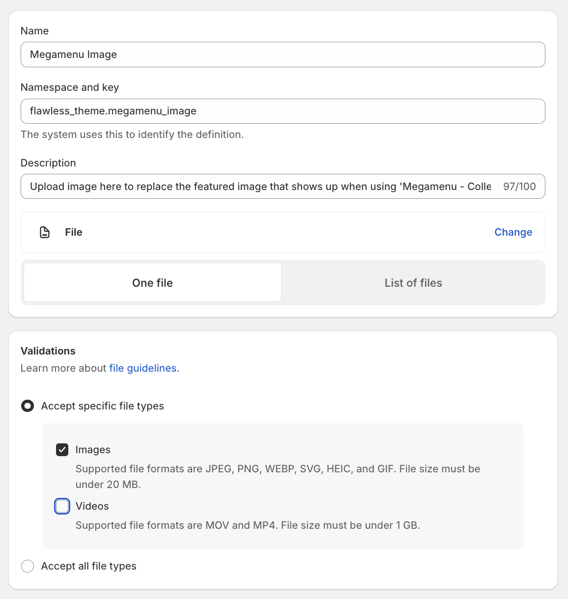
Make sure you select the same Validation settings that are mentioned in the image above.

This metafield will now be available to you in your collections.
Example Use case:
If you have linked the "Summer sale" collection to the mega menu and you want a different image, now you can upload a specific image that represents your "Summer Sale" collection better than the default featured image. This custom image will then appear in the mega menu, enhancing visual appeal and potentially attracting more clicks.
- No of columns:
Sets the number of collections to show. If set to 4, then the layout will change to a carousel to accommodate the rest of the collections.
Image Ratio:
- Set the desired image size for the collection images displayed within the mega menu. This setting allows you to maintain consistency in image dimensions, ensuring a visually appealing presentation. Specify the aspect ratio or dimensions that align with your design requirements and optimize image quality and clarity. Common ratios include Adapt to Image, square (1:1), landscape (4:3), or portrait (3:4), depending on the visual aesthetics of your images.
- Content Alignment:
- Choose the alignment for the collection heading relative to the collection images within the mega menu. You can align the collection links left, center and right relative to collection images to create a visually balanced layout. Aligning the content under the collection images ensures clear hierarchy and readability, guiding users to explore the collection effortlessly. Customize the alignment based on your design preferences and the overall aesthetics of your header mega menu.
Product | Mega Menu

Enhance your navigation with a Product Mega Menu in the header. It links directly to collections or product lists and displays a side menu with the selected menu item. Customize it to match your brand, making it easy for users to find products
Layout Settings:

Menu Item:
- Specify the name of the menu link that you want to feature as the Product Mega Menu in the header. This menu item will act as the entry point for users to access the Product Mega Menu
- Show or Hide Side Menu Heading
- This setting allows you to choose whether the side menu heading is displayed or not. By toggling this option, you can either show the heading to provide clear navigation context for users or hide it for a cleaner look.
- Menu Heading Text Box
- This text box lets you customize the heading text that appears in the side menu. If you leave this field empty, the default text shown will be the name of the Level-1 menu item. This feature is useful for providing alternate titles that might better describe the menu content or fit your branding.
- Feature Product Picker
- With the Feature Product Picker, you have the flexibility to either link a collection of products or select a specific list of products. This setting allows you to highlight certain products directly within the mega menu, making it easier for users to find featured or recommended items.
- Heading Input Box
- This input box allows you to override the default collection name when a collection is linked using the Feature Product Picker. By entering a custom heading, you can better tailor the text to match your marketing goals or to provide more context about the featured collection.
Show Link and its settings
This setting enables you to add a custom link within the mega menu, allowing further customization of your navigation. You can control the link's position (start or end of the menu), choose its style (display as text or with a default arrow icon), and customize the link text and URL. This flexibility ensures the link fits seamlessly with your design and provides users with clear navigation options.