Shoppable Image

The Shoppable Image section in your theme editor allows you to create interactive images with clickable hotspots that link to your products. This guide will walk you through the section and block level settings available for configuring your shoppable images.
Section Settings

- Image Settings
- Select Image: Choose the image you want to make shoppable.
- Image (Mobile): Option to select a different image optimized for mobile view.
- Image Size: Adjust the image size to either adapt to the image dimensions or fit specific dimensions.
- Image Position: Set the image alignment to either the right or left.
- View Products Button
- Toggle to display a button that links to the product(s) when a hotspot is selected. This button will open the "View All Products" drawer, showcasing all products linked to hotspots and product links in the image block.
- Show product in first hotspot
- This setting will by default enable tooltip for first product

- Hotspot target
- This settings defaults to quick view which will open quick view drawer if user clicks on it but if you prefer your users to take them to product page then you can select product page.
- Appearance
- Padding Top/Bottom: Adjust the padding above and below the image.
- Color Scheme: Choose and edit the color scheme to match your theme settings.

Block settings
Hotspot block
The Hotspot block is mapped to the main image layout. It allows you to add interactive points on your image that link directly to your products.
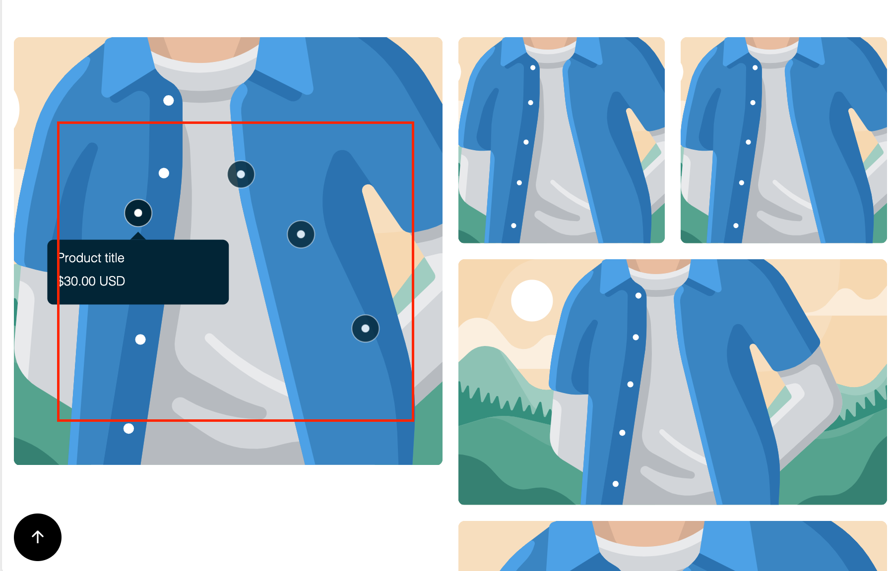
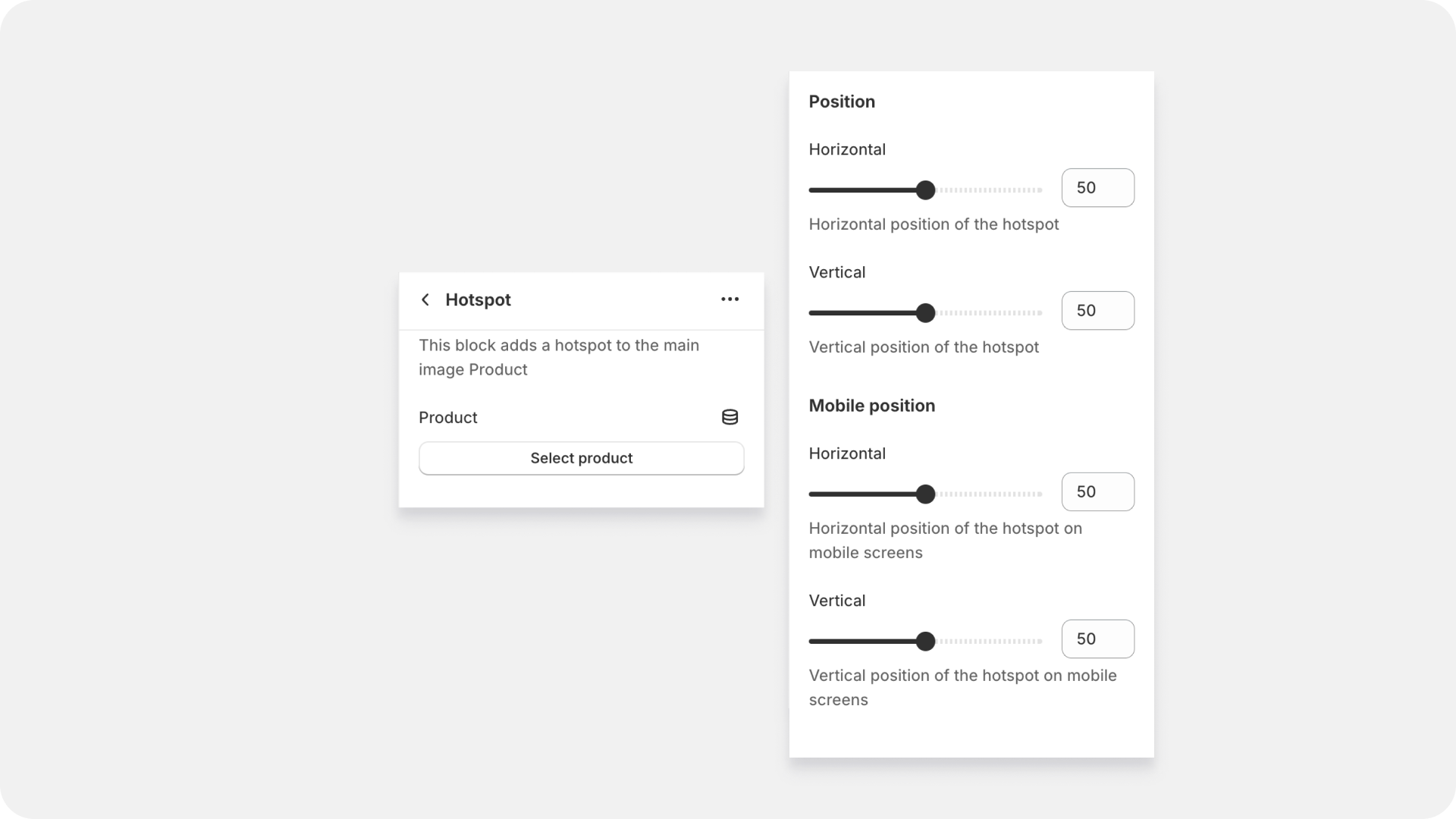
- Select Product
- Choose the product to link with the hotspot. You can link one product per hotspot.
- Position on Hotspot
- Adjust the position of the hotspot using range sliders. For desktop view, adjust the horizontal (X) and vertical (Y) positions. For mobile view, adjust the horizontal (X) and vertical (Y) positions separately.
Image Block Settings
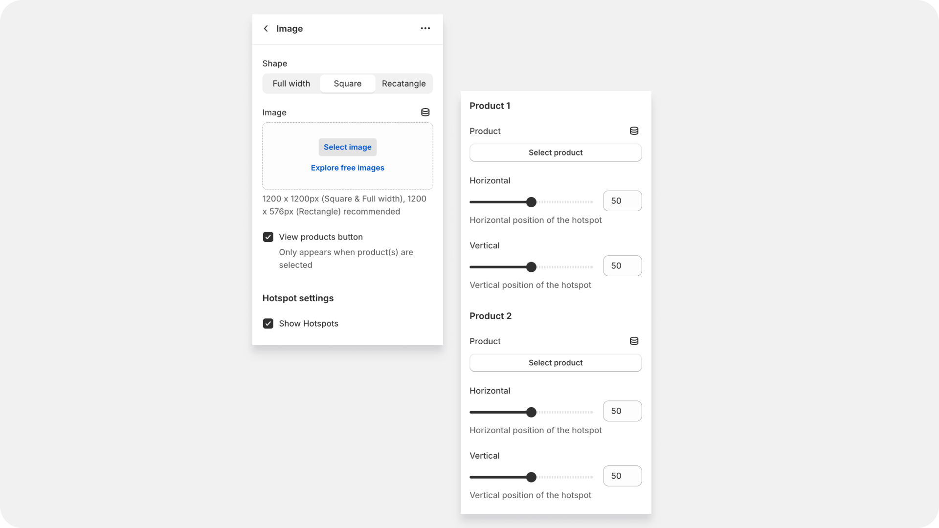
- Shape
- Choose the shape of the image container : Full Width, Square, or Rectangle.
- Select Image:
- Choose the image for the block.
- View Products Button
- Toggle to show a button linking to the product(s) associated with the hotspots. This button will also open the "View All Products" drawer.
- Hotspot Settings
- Toggle to display hotspots on the image.
- Link to Product
- Product 1: Select the first product to link with the hotspot.
- Product 2: Select the second product to link with the hotspot.
- Adjust the horizontal and vertical positions of the hotspots for Product 1 and Product 2 on both desktop and mobile views. For Product 1, you can adjust the horizontal and vertical positions of the hotspot in the desktop view, and similarly, adjust the horizontal and vertical positions in the mobile view. For Product 2, the same adjustments can be made: set the horizontal and vertical positions of the hotspot in the desktop view, and then adjust the horizontal and vertical positions in the mobile view.